Grounds
Grounds briefs you on someone minutes before a coffee chat. People called my first design really cool, and some called it creepy. The redesign says what it isn’t sure of, and uses only what people posted about themselves.
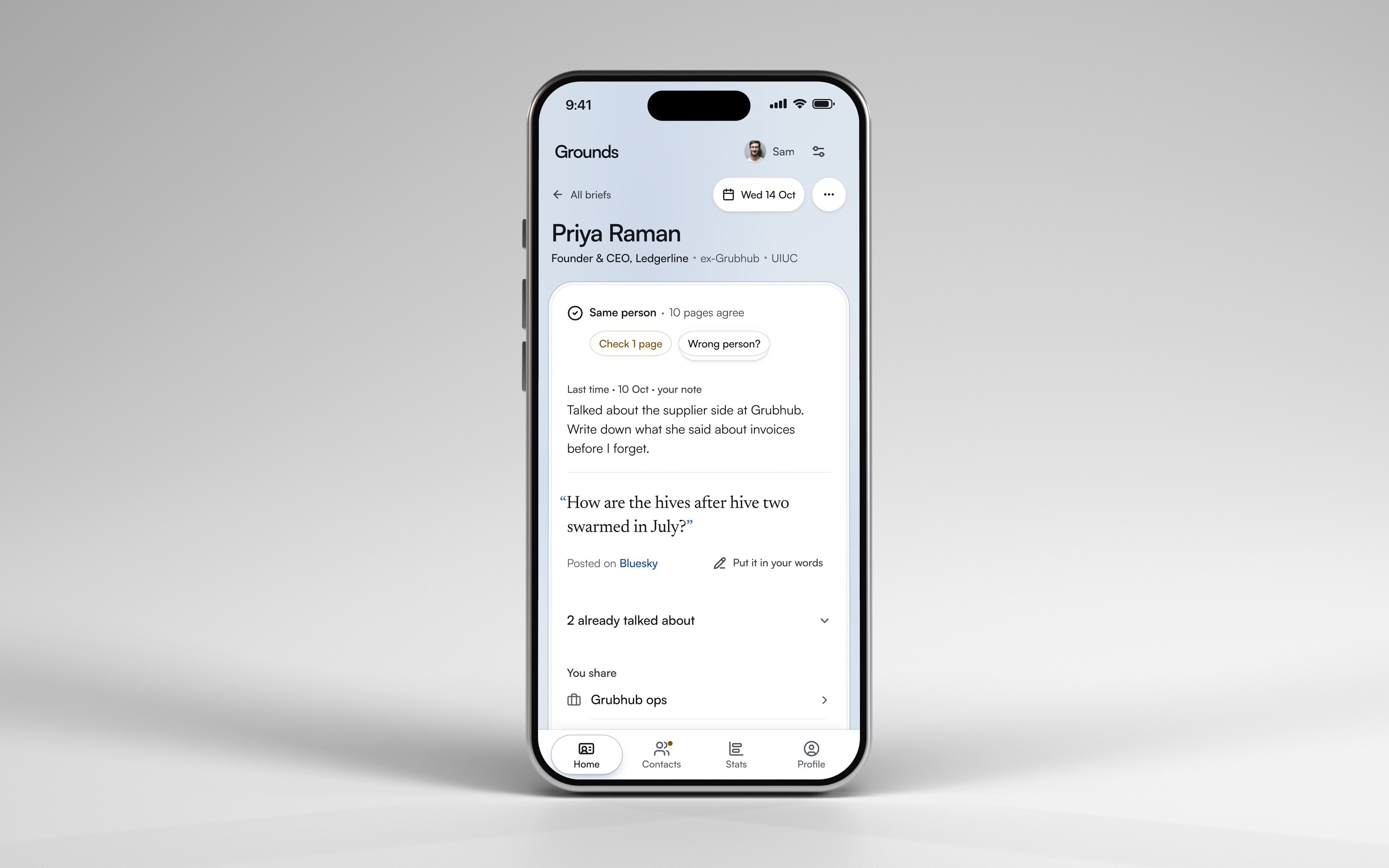
The redesign on a phone, with the app’s sample person. The screen is a capture of the real app; the phone is a 3D render.
Team
Four students
When
Sep to Oct 2026
Tools
Figma, Next.js, Vercel, Claude Code
What Grounds is
Four of us built the first version at a student hackathon in one weekend. It read someone’s public pages and wrote a brief: who they are, what you share, and a question to open with. I designed every screen: the layout, the interaction and the visual system.
The timeline is where I argued about what goes on the screen, not just how it looks. Our first one was a single line of dots. I asked for a timeline that was "colorful and nice and detailed" and opened into the full story when you clicked it. The team doubted people would use it. I made the case, and it shipped twelve minutes before the pitch. It’s in the redesign too, as the Path tab.
Too sure, and too personal
It sounded certain when it wasn’t, and it showed more than people wanted.
About 20 to 30 people used the hackathon build. We also ran it live on one of the judges, and it pulled up his own public information in front of him. People called it really cool. Some also called it creepy, and that’s where the redesign started.
I designed the confidence sheet, and I gave its biggest type to the score. But 100% only meant that enough ordinary things matched, like the name, employer, title and city. The one page it doubted sat at the bottom of the sheet, under Left out. Try it below: attach that page by hand.
How sure was it?
Grounds found 14 pages with Priya Raman’s name. She’s the app’s sample person.
The right person
100%
11 sources verified · public only
Left out, could be them
- Founders of Chicago ep. 41: Priya RamanVideo, Apr 2026Matched on name and location (Chicago). Not enough to attach on its own; you can attach it if you know it is them.
The 11 pages it attached, each scored 100
- priyaraman.coWebsite100
- Why restaurant invoices are broken (and who profits)Article, Mar 2026100
- Ledgerline raises $3.2M to untangle restaurant supplier paymentsArticle, Oct 2025100
- Priya Raman on the invoice that broke her (The Margins Show)Podcast, Feb 2026100
- Priya Raman: Boring software for two-percent margins (Chicago Founders Night)Video, Nov 2025100
- priyaramanGitHub100
- @priyaraman.coBluesky100
- @priya.keeps.beesInstagram100
- What four years at Grubhub taught me about operationsArticle, 2022100
- About LedgerlineWebsite100
- Alumni spotlight: Priya Raman, BSIE 2017Article, 2021100
A precise number reads as a confident one, so it can earn more trust than it deserves.
When I asked people why it felt creepy, they pointed at three things (my notes from those talks, not a recorded study): a photo of the person, facts gathered without them knowing, and personal details they hadn’t posted themselves. Two of those came from my own requests on demo day: a "profile photo" and "personal and career related interests". The facts weren’t the problem. Where they came from was. A job change someone posted on LinkedIn is fair to bring up. The same fact from a people-search site isn’t.
The redesign
I rebuilt the brief around one question: is this really them?
After the hackathon I redesigned it on my own: I set the direction and made each call on this page. For the pitch we wanted it to impress. For real use, it had to work for someone nervous, on a phone, minutes before they walk in. The goal was that every screen answers four things within a minute: who they are, what you share, what to talk about, and whether it’s really them.
How should it say how sure it is?
In words: the pages sorted into Matches, Check this one, and Left out, each with the reason.
Not chosen
A percentage
It sounded certain when only four ordinary things matched.
A dot with “11 sources verified”
It hid the pages it was unsure about, and the ones it ruled out.
Cost I accepted
A longer line than one number. When the evidence is thin, it says “Probably…” in amber instead of a check mark.
What should a brief show?
Only what people posted about themselves, in public: their profile, their own site, talks, articles and accounts their profile links to. Every line says where they said it.
Not chosen
Everything public about them
In a 569-person survey, whether information felt acceptable depended on who received it and why, not just on what it was. A personal Instagram is public, and it’s still out.
Work only, no hobbies
Hobbies people post themselves are often the easiest way in. “I heard on your podcast you keep bees” sounds prepared; “I know you keep bees” sounds like stalking.
Their photo
A photo of the person was one of the things people called creepy. Initials instead.
Cost I accepted
Briefs get thinner. Someone with little online gets an honest, short brief that says what’s missing. And it still reads pages without asking them, so it keeps to what they chose to post, and always says where.
How do you read it in a minute?
One card with the answers; every row opens its detail in place, and the tabs hold only what the card doesn’t. On a phone the brief went from 4.5 screens to 3.3.
Not chosen
Everything on one long page
The same things appeared twice, one scroll apart.
Cost I accepted
Some detail is a tap away, so someone in a hurry may miss it.
Where it is now
It’s built, and it isn’t tested with users yet.
The redesign runs end to end with sample people: paste a profile, watch it read, open the brief, log how the conversation went. It hasn’t met a real user.
Next is a short test with five students on their own phones. Each gets up to ninety seconds to say what they’d open with, one thing they share, one thing the person does outside work, where they worked before, one thing to avoid, and whether it’s really them. The fifth gets a brief with a page about a different person slipped in, to see if they catch it.
If I did it again, I’d decide how it shows doubt in the first hour, and I’d design the phone first. The hackathon version was made to impress a room. The people who need it are walking into one.
How I worked
I used AI for desk research, gathering design references, critiquing screens and refining visuals, and I built the app with Claude Code as a coding partner. Every design call on this page was mine.
Sources
Show every sourceLess
The images and the film of the redesign are real screenshots and screen recordings of the running app. The iPhone is my own 3D model, rendered in Blender at Apple's published size. The MacBook is mrmockup's free MacBook Pro 16 mockup from Figma Community. The screens themselves are not redrawn.
- "A precise number reads as a confident one." Jerez-Fernandez, Angulo and Oppenheimer, Show me the numbers, Psychological Science, 2014. Measured on people’s answers, not on software.
- "In a 569-person survey…": Kirsten Martin and Helen Nissenbaum, Measuring privacy: an empirical test using context, Columbia Science and Technology Law Review, 2016. 569 people rated 22,760 short scenarios; how acceptable sharing felt was "highly dependent" on who received the information and how it was used. Stated judgments, not behaviour.
- "Where it came from" decides whether a fact feels fine. Helen Nissenbaum, Privacy as Contextual Integrity, 2004. The LinkedIn example is mine.
- 100% and 96%: the hackathon build’s own sample data and rule. Each page got its own score from fixed rules (name and employer reach 70; title and city take it to 100), and the card showed the average of the pages it attached. A page attached by hand kept its own score, so eleven at 100 and one at 55 average 96.25, shown as 96%.
- About 20 to 30 people used the hackathon build: my own estimate, not recorded. The judge demo and what people said: my own account. Not recorded, and no count.
- The demo-day quotes ("colorful and nice and detailed", "profile photo", "personal and career related interests") and the timeline times: the team’s project history. The argument about the timeline was in person: my own account.
- 4.5 and 3.3 screens: each version’s whole brief page as it opens, for the same sample person, on a 390 by 844 phone screen, measured in the browser (3,756 and 2,749 pixels tall).
- The sample people are made up for the demo.